In this hands-on, I'm going to tell you if Apple's all-new, all-colorful M1 iMac is for you. Your office, your shop, your home, your kitchen, your living room, you family, your kids….You! And, which one?
The M1 Fix
So, you want a Mac not an iPad, and you're leaning towards a desktop Mac not a MacBook — you're not going to be throwing it in a bag or carrying it around, and you're intrigued by the idea of a big, expansive, built-in-display, so you can have all your app and web windows open all at once, or just be all-in, on a a full screen, immersive video or game.
But the old iMac just wasn't for you or your space. It was too… big, bubble-butt backed, bead blasted aluminum — a slab that just didn't fit or feel part of the room, much less you or your life.
Well, Apple's fixing the first part with their custom M1 system-on-a-chip. It let them take that big, hot, power-hungry Intel CPU and GPU, separate RAM modules, all of that… buffet on a board, and condense it down into a highly integrated, highly efficient, super tasty new silicon sandwich that takes up almost no space at all.
For the MacBook Air and entry-level MacBook Pro, which got their transplants late last year, M1 meant instant, industry leading performance efficiency, and just… industry smashing battery life. Like 15 hours plus on a single charge.
iMacs aren't laptops, though, they're desktops, you're saying. They don't have batteries. They're perpetually plugged in. And I hear you. So what does M1 mean for the iMac?
Well, the exact same industry leading performance efficiency — some of the best single core cpu and integrated gpu speeds in the business, and the ability too run those 2 efficiency cores, 6 performance cores, up to 8 graphics cores, 16 neural engine cores, image signal processor, custom encode/decode blocks, all the IP, flat out, for basically… ever. All in an enclosure so thin and unobtrusive it could easily be mistaken for a giant iPad on a kickstand.
Yeah, up to 7-GPU, because when some of those chips come out of the foundry, they don't have all the cores in perfect working order. So if it's just one graphics core, rather than throwing it out, Apple's saving some money — for them and for us — by offering the 7-core chips in an entry level model for $1299 instead of the starting-at-$1499 price tag for having all 8 GPUs fully operational.
Most people will be 100% fine with 87.5% of the GPU cores, but there are some other hard limits on the entry-level which I'll get to in a hot minute.
Taste the rainbow
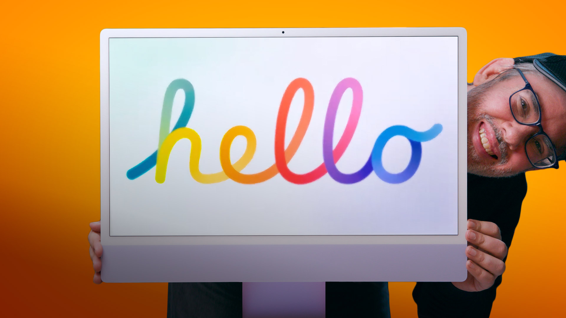
What Apple's also doing is taking the less obtrusive design opportunity afforded by M1, to flip the script back and lean totally into that retro future chic direction they've been doing for a while now on the iPad and iPhone. To rediscover a little of the post OG Bondi iMac magic. Too… Hello again us… again. With color.
iPods have been nano-chromatic for effectively ever, at this point. The iPhone flirted with 5c, but didn't go all-in until the XR, and the iPad… with the latest Air. And I love it. It's a super effective way to engage with the larger, more mainstream market. To give technology a little more personality… pizzaz.
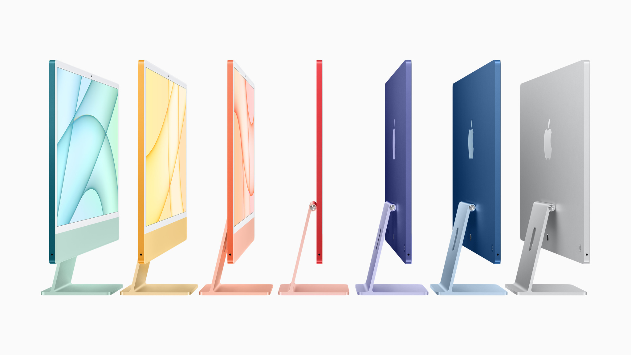
So, we're getting the full taste-the-rainbow of Red, Orange, Yellow, Green, Blue, Purple, and White… at least on the $1499 model and up. With the $1299 entry-level model, you can only choose between Red, Green, and Blue — RGB — and white. That's probably to keep stock costs down and drive demand up, because they're obviously not binning for colors. Sorry, silicon jokes.
Apple has said they picked the precise hues and shades to complement or contrast the widest possible range of tastes… and existing interior designs. Including color matching all the cables, from the new power brick to the trusty Lightning chargers for the also color matched accessories. Magic Mouse, which I've never been a big fan of, Magic Trackpad, which I all-caps love, and Magic Keyboard, which comes basic with the $1299 model but graduates to Touch ID on the $1499 and up model.
Touch ID goes desktop
Apple's been doing secure authentication relay from the iPhone and Apple Watch to Mac for years now, so that tech is time tested and locked down. You have to double click the power button on the iMac first setup to prove proximity.. and a secure element in the keyboard, similar to the old T1, that transmits an encrypted, time-of-flight-checked token to the iMac.
Yeah, it totally sucks that it's taken like 8 years for Touch ID come to come to desktop Macs. But at least it's here now for Apple Pay, authentication, fast user switching… everything that benefits from secure convenience. But yeah, it still just sucks that it's 4 years later and we still don't have Face ID on the Mac. Biometric baby steps, I guess?
Oh, and the Touch ID Magic Keyboard will work on other M1 Macs, you just can't buy it separately, at least not yet. But you know what? When you get an M1 iMac, you can call up AppleCare and ask to buy replacement or additional color-matched cables and accessories — make of that information what you will.
Bezel drama
Here's something else interesting about the colors — they aren't uniform. They're duo-toned… I mean like unabashedly mullet chic, with bright, bold parties-in-the back but paler, more pastel, all-business shades up front.
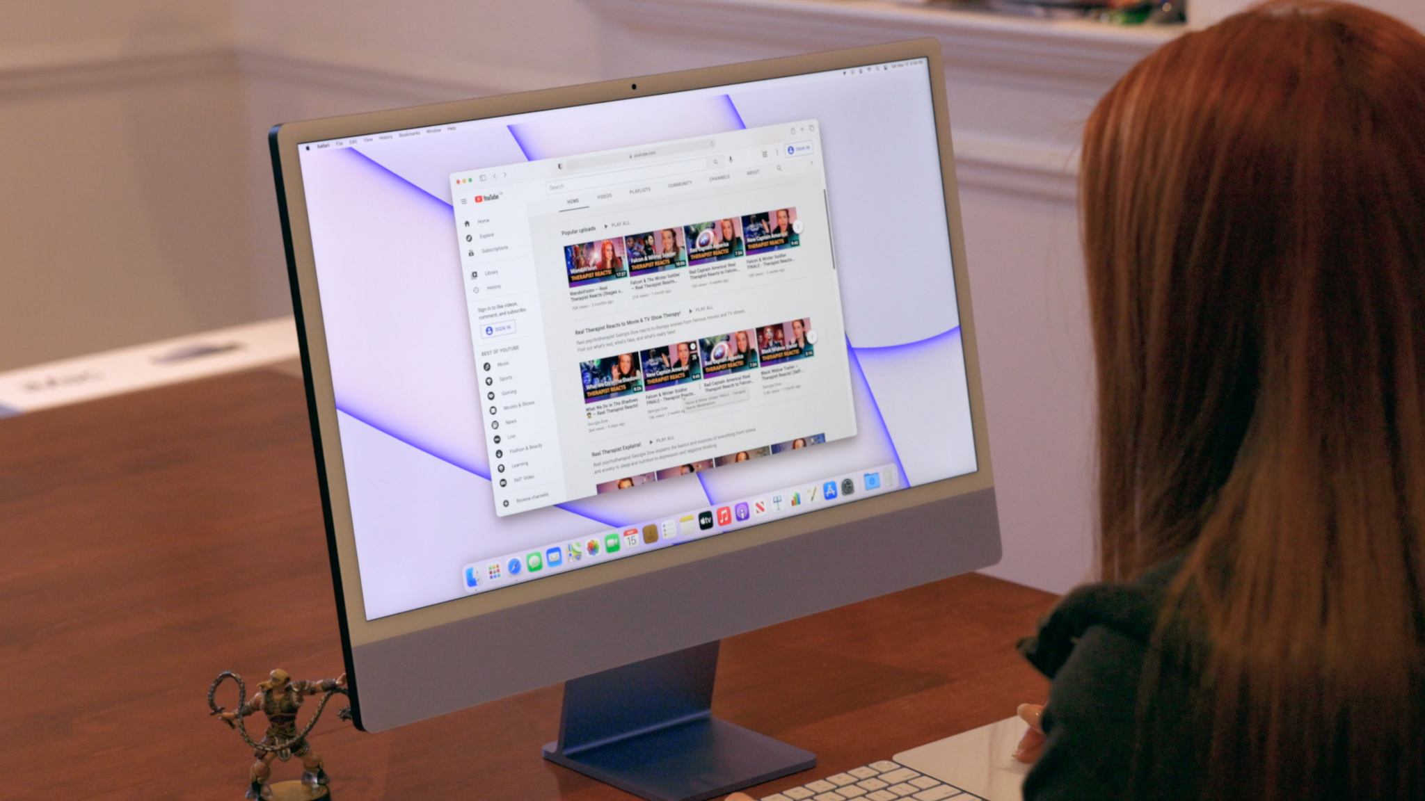
That includes off-white bezels around the new 24-inch, 4.5K resolution, 500 nit bright displays, which, honestly, I kinda hated at first hot take, but… after living for a few days now with this purple review unit on loan from Apple… I'm really starting to feel it. It's so retro but so right. Don't judge me… you have to see in place.
The display itself is gorgeous. Nothing revolutionary like mini-LED on the iPad Pro or nano-texture on the 27-inch iMac, but high density, wide gamut, dynamically white balanced, super bright and anti-reflective, and still better quality than pretty much any stand-alone display you can get… even at approaching the same price. Which is why I think many desktop Mac stans go for the iMac over the headless Mac mini. We just want to look at something that doesn't make our eyes bleed. And until Apple re-releases a display that's not…. 6K for 6K, this is what we got.
Which is why it's all shades of frustrating Target Display Mode still hasn't made a comeback, sacrificed as it was to the custom TCon gods of Oh-god-why-can't-intel-get-its-Hi-DPI-connection-crap-together.
For now, but hopefully not for always, if you want to take over the iMac as a display, you're stuck with some flavor of screen sharing or Remote Desktop. While I just keep bugging Apple to expand AirPlay and Sidecar so we can target any Mac display with them as well. Because a nerd can dream!
I also wish you could do more than just tilt the iMac display up and down, like raise it and lower it as well, angle it even without having to drag the stand like it's a Justin Long commercial.
That was something you could once do with the very Pixar-like second great iMac design of yore, which had a big old computer-in-the-base for counter-balance. These days there's a VESA-mount option for that, but you have to order it instead, though it's the exact same price. And, honestly, a terrific option if you want that floating look or need the flexibility of an arm, and don't think you'll be moving the iMac around as much. I mean, not to the coffee shop or anything, wicked post lockdown flex as that might be, but even between the kitchen and the den, the patio and the studio, front-of-house and back.
Which you totally could if you really wanted to, because the whole new thing is under 10 lbs — like you could do Fitness+ bicep curls with it in a pinch — and combined with its so-flat-it's-almost-2D design, it makes the iMac feel… translucent. Not literally like the original iMac see-though plastic, but effectively. Just light and airy and something you can easily slide into places you'd never think of putting the old, bubbled, aluminum version, or be allowed to think about it by the non-techies in your life. Like on a counter to FaceTime cook with friends, or a guest room so you can Zoom-school or work from home in peace. Or a room with no TV but where you still want to watch a video on a screen big enough for the whole family.
Now, I'm just going to say it — I do miss the Apple logo on the chin. And I know, I know, some of you wish there just wasn't even a chin at all any more, but that's where the whole entire computer and speaker system has been crammed, and it's also what makes an iMac so distinctively an iMac. And missing the Apple here is like… missing the hood ornament on an Lambo, or the halo from the effect.
The ports situation
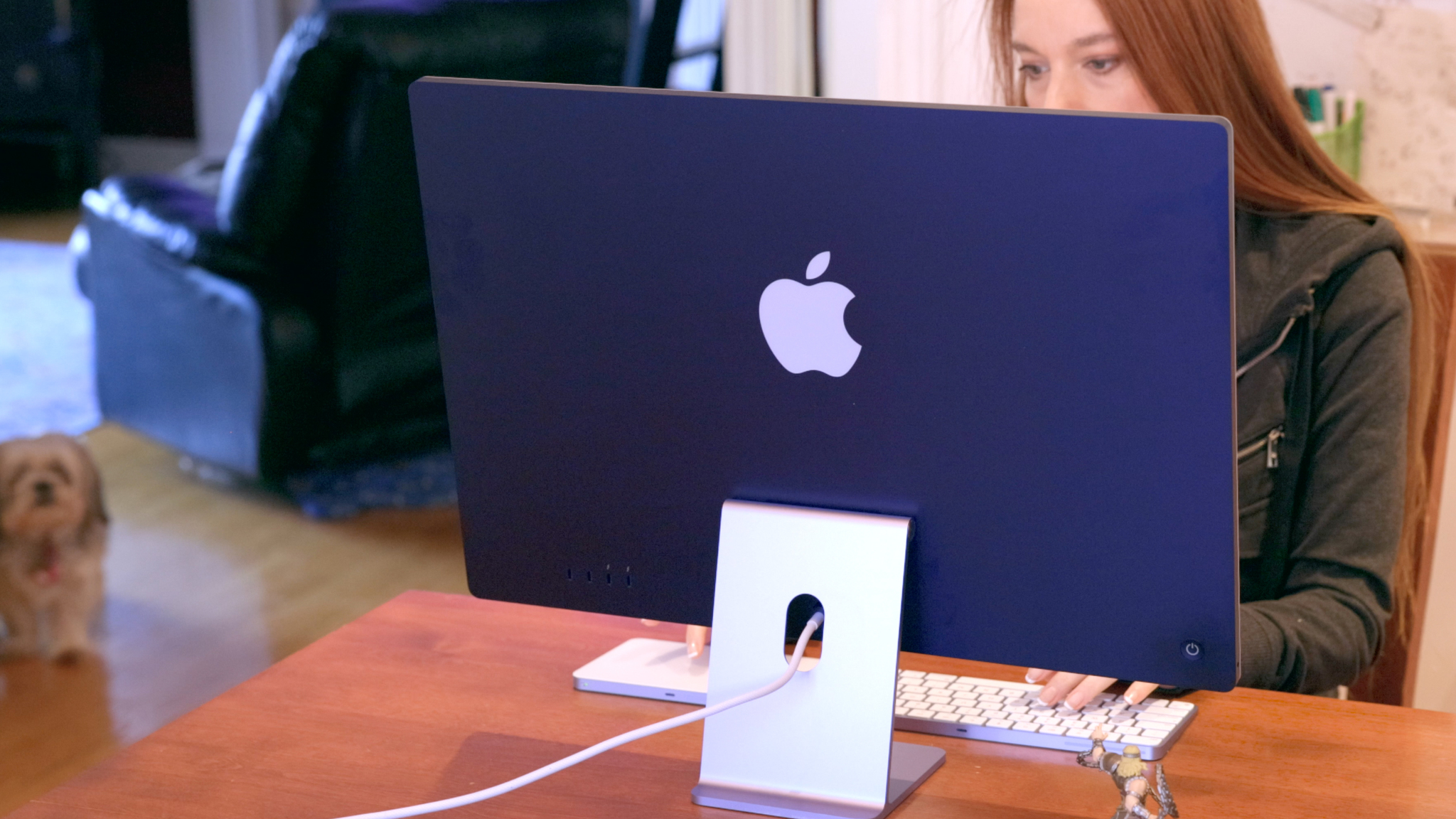
I'm also not a huge fan of only two ports on the back of the $1299 entry level model. They're USB4 ports, which use the USB-C connector but also offer Thunderbolt 3's 40 gigabit per second data transfer speeds, which can handle pretty much up to any NVMe drive or 6K secondary display you want to throw at them, and hubs aren't as annoying on desktop as they are laptop, but it still harshens the whole all-in-one aesthetic Apple has otherwise nailed so hard with this new iMac.
You can get two extra USB-C connectors on the back of the $1499 and up models, but they're USB3 not USB4, which means no Thunderbolt 3 compatibility. It's a limitation of M1 having only two thunderbolt controllers on-board.
Apple hasn't deleted the 3.5mm jack, though they had to move it to the side so it wouldn't chest-buster through the display with every plug-in. Because so so thin now. Also, interestingly, they put an ethernet adapter on the all new, all-very MacBook like external don't-call-it-MagSafe-any-more-because-iPhone-stole-that-name power adapter that comes with the $1499 and up iMacs.
So, decide how many ports you really need on the iMac itself and how many you're ok breaking out with an external boxes.
Speaking up
But also by continuing to go all-in on audio tech built in with what they claim are the best camera, mic, and speaker systems ever in a Mac. Now, camera is like the lowest bar ever. MacBooks are still stuck on 720p and even the bigger 1080p Intel iMac cams have been stuck with the T2-chip's A10-level image signal processor — ISP — for years. Since M1 is effectively an A14 Bionic with X-as-in-Extra cores and Mac-specific silicon, it effectively has the iPhone 12 and iPad Air's latest generation image signal processor. Which is terrific for color balance, exposure, all the computational assists. You can never beat great lighting but this will take absolute advantage of all the light you can give it.
The Mics and camera though, well, Apple has been improving those by leaps and bounds for the last few years, ever since they assembled the audio avengers and gave them a massive new lab to ramp up all that HomePod tech. And it shows. Apple calls the Mics studio quality, but for they're still about average USB mic quality. Like a Yeti but not one of the more abominable ones The speakers are…legit amazing for something this thin and narrow. Full on spatial audio up to and including Dolby Atmos.
Not the fancy move with your head kind you get with the iPhone or iPad and AirPods Pro or Max, though. Because the iMac lacks their motion sensors. But I hope that changes and soon because dynamic spatial audio just needs to be everywhere.
(See the video embedded at the top for samples.)
M1 Memory
Same for memory. The M1 Macs are limited to 8 or 16 Gigabytes of RAM. It's on-package, and unified memory, which means its connected to the CPU, GPU, all the three-letter silicon acronyms, and it uses Apple's memory compression and ultra-fast swap, so those 8 and 16 Gigabytes are absolutely all they can be. But they're still 8 and 16 Gigabytes. So if you're running multiple, memory intensive apps at the same time, — or if you know what memory pressure means — you're going to want to go for 16GB. And if know you're going to need much more than that, like 32 or 64 or more, you'll need to look at the Intel 27-inch iMac Apple still has on the shelves, or wait for whatever next-generation Apple silicon iMac replaces the higher end, Pro version sometime in the next few months or year.
Same for the SSD as well. The M1 iMac starts at 256GB and goes up to 2 TB, and you can absolutely hang more externally, but if you demand more internally, you're going to have to go 27-inch or wait for whatevers coming next.
Because these aren't meant to be Pro machines. You can tell by them having all the fun colors. Pros only ever get silver or space grey, the same color as my salt over the lack of Pro colors, frankly.
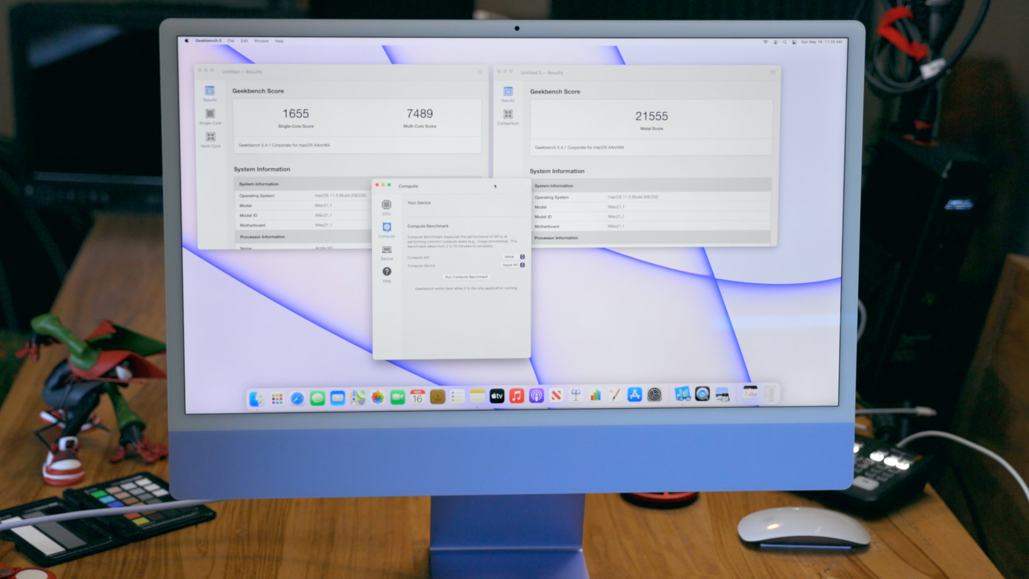
Now, you can totally do Pro workflows on M1, multiple streams of 4K, an 8K stream even, tons of audio plugins, all the Xcode, 3D and ML modeling for days… Ignore 99% of the benchmarks. Outside AnandTech, most people have no idea how to really run them or how to translate them into anything meaningful when it comes to anyone else's specific workflows. In terms of time to completed work, especially if you're using M1 native apps, and extra especially in terms of responsiveness and time saved from living an almost beachball free life, at this power profile, there's just nothing else that even comes close.
They're just not meant to be Pro-as-in-iMac-Pro machines. Totally fine for home, school, or workplace, just not… workstation.
The ecosystem
I think that's why Apple's leaning so hard into Continuity for this new iMac as well. That's their technology that lets you tie all your Apple devices into one, private, secure workflow. And I'm here for it. It's one of my favorite things Apple ever did and for my analyst money, one of the most important. I use it… constantly. Copy on my iPhone and paste on my Mac, or vice versa. Start messaging or browsing on one and swipe or tap to instantly continue on the other. AirDrop a photo to use as a thumbnail in Photoshop for Mac, or vice versa to post on Instagram. To instant tether to LTE or 5G when the internet goes out but the upload or download must go on.
It's the value prop of not just better together but the more parts you get the even more valuable the whole sum becomes — which I know works great for Apple's earnings but also happens to work really great for me, which is the only thing I personally actually care about.
I think that's where this new 24-inch M1 iMac will slot in just ever so sweetly. Because it's not just lightyears beyond the old 21.5-inch Intel iMac, it's like a whole new iMac. A whole new category of iMac finally has some of that Think Different flavor back. Seriously, I don't think I've been this surprised or delighted by an Apple product since the 2018 iPad Pro. And that was still silver and gray.
Bottom line
With the M1 iMac, Apple hasn't just come full circle in terms of color and personality, but used the momentum to slingshot their most iconic personal computer into a whole new universe of performance and capability.
Again, if you want an iPad or MacBook, something you can throw in a bag and take with you, the M1 iMac ain't it. And if you need bigger pro workflows, you should absolutely wait on bigger pro M-series iMacs. Check out the playlist above for more on all of that.
But, for anyone who's been waiting on the iPhone XR or 12 of iMacs, the iPad Air of iMacs, hell, the MacBook Air of iMacs, lowest cost more limited $1299 or better tricked out $1499 and up, whatever it is you really want in terms of color or need in terms of ports, memory, storage, and Touch ID — well, this is absolute it chief.


0 Commentaires